
Monday, 24 March 2014

Friday, 21 March 2014
Digipak design
This is my digipak that I have designed and created on photoshop, using photos of karl that were taken by myself, in specific locations, I then edited the photos to make them individually unique, and to a professional level.
These are the photos that I have used on my digipak.
This will be the front cover -

This will be the inside of the digipak where the cd will sit -


This is the final version of the digipak showing how it would look when finished.
These are the photos that I have used on my digipak.
This will be the front cover -
This will be the back cover for the digipak -
This is the final version of the digipak showing how it would look when finished.
Thursday, 20 March 2014
What is a digipak?
A digipak is essentially a CD album case. A digipak is usually made out of card and is usually 3 layers folded together, then put into the casing.
Digipaks benefit the music artists as they have extra information inside for the fans to read, such as the track lyrics, song inspiration, song writing etc. Digipaks were invented by Meadwestavco.
The average size of a digipak is usually 12.5x12.5mm


Digipaks benefit the music artists as they have extra information inside for the fans to read, such as the track lyrics, song inspiration, song writing etc. Digipaks were invented by Meadwestavco.
The average size of a digipak is usually 12.5x12.5mm
Wednesday, 12 March 2014
Digipak analysis of 50 cent
50 cent - Get rich or die tryin'
The third digipak i have chosen to analyse is 50 cent's Get rich or die tryin'.
The front cover of the album -
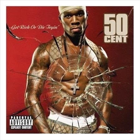 On the front cover the first thing that stands out straight away is the image of 50 cent with the effect that he is standing behind glass that has been shot, hence the bullet hole in the center. This effect not only stands out and draws your attention to the middle of the album cover but also gives you the impressions he is involved in violence especially guns as shown by using a bullet hole.
In the cover he is photographed topless with a huge gold chain which is easily visible and shown clearly through the bullet hole. This is a common convention in the rap genre so therefore this is a very conventional album cover. The fact he is topless is a bit narcissistic as if he is showing of his body.
Another point is that the titles are very visible such as the artists name in the top right of the cover with the name of the album in the top left hand corner, a different font is used for each to split your attention and ultimately draws you to the main image of 50 cent in the centre.
The back cover -
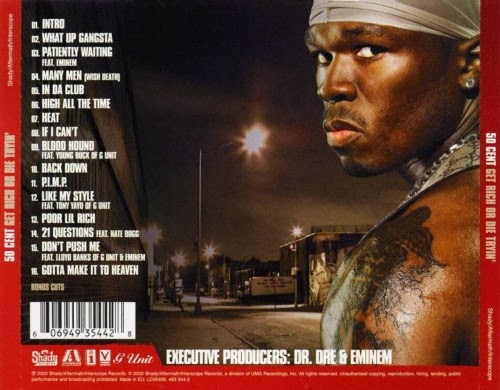 On the back cover of this album it clearly names each individual song with the track number, which are easy to read and makes it easy for the audience to locate their required song easily. Also the layout is set out so the picture is on the right and the text doesn't overlap which doesn't make it hard to read. Around the edge is a bold red border which has the name of the album on both the left and right, it also draws your attention to the centre.
At the bottom of the back cover is the executive producers which is clearly stated next to the background and all the other logos and companies are in the bottom left corner. The one major picture is of 50 cent from and over the shoulder angle. Which conveys he always needs to be looking over his shoulder or be on 'a look out'. This also shows of his tattoo's, chain and du-rag, all conventional of rappers. In the background shows a poor ghetto area showing you what type of neighbourhood he could of come from and gives you a slight insight into his background.
The spine -
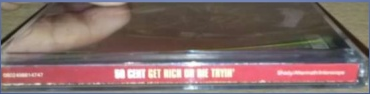 The spine of the digipak has the same bold red as the back cover on the album. The spine has the artists name and the name of the album 'Get rich or die tryin'' these are clearly stated to make it easy for the audience to read. It will also make this album stand out when on a shelve in the music shops.
The inside booklet -
 Within the inside booklet of the digipak the main noticeable thing is the picture of 50 cent wearing a diamond encrusted silver chain and showing off his jewellery. A generic convention of rap videos in that they contain a lot of expensive watches and chains etc.
The chain has a huge christian cross attached which shows that he could be religion. Also there is no text at all and on the inside just the large picture which takes up the majority of the page.
The watch from the front cover can also be seen here connecting the first and second image on the inside booklet. On the interior of the booklet there is another image of 50 cent holding a baseball bat
behind his shoulders, this emphasises his 'gangster' image. The background image is similar to the image shown on the back cover which shows a rundown area which would normally relate to the rap genre.
The first five songs are in the right hand corner with which a little information about each song which include the lyrics and how he came up with the song.
The disc -
 There is only one disc included in this digipak which has all the songs included on the album. On the disc is the name of the album in silver on top of a black background. The CD has bullet holes on it, implying it has been shot. This complies with the generic conventions such and guns and violence. The black background of the dic implies power, wealth, mystery as well as making a change from the bright red background which is used throughout and really makes the black stand out.
The third digipak i have chosen to analyse is 50 cent's Get rich or die tryin'.
The front cover of the album -
On the front cover the first thing that stands out straight away is the image of 50 cent with the effect that he is standing behind glass that has been shot, hence the bullet hole in the center. This effect not only stands out and draws your attention to the middle of the album cover but also gives you the impressions he is involved in violence especially guns as shown by using a bullet hole.In the cover he is photographed topless with a huge gold chain which is easily visible and shown clearly through the bullet hole. This is a common convention in the rap genre so therefore this is a very conventional album cover. The fact he is topless is a bit narcissistic as if he is showing of his body.
Another point is that the titles are very visible such as the artists name in the top right of the cover with the name of the album in the top left hand corner, a different font is used for each to split your attention and ultimately draws you to the main image of 50 cent in the centre.
The back cover -
On the back cover of this album it clearly names each individual song with the track number, which are easy to read and makes it easy for the audience to locate their required song easily. Also the layout is set out so the picture is on the right and the text doesn't overlap which doesn't make it hard to read. Around the edge is a bold red border which has the name of the album on both the left and right, it also draws your attention to the centre.At the bottom of the back cover is the executive producers which is clearly stated next to the background and all the other logos and companies are in the bottom left corner. The one major picture is of 50 cent from and over the shoulder angle. Which conveys he always needs to be looking over his shoulder or be on 'a look out'. This also shows of his tattoo's, chain and du-rag, all conventional of rappers. In the background shows a poor ghetto area showing you what type of neighbourhood he could of come from and gives you a slight insight into his background.
The spine -
The spine of the digipak has the same bold red as the back cover on the album. The spine has the artists name and the name of the album 'Get rich or die tryin'' these are clearly stated to make it easy for the audience to read. It will also make this album stand out when on a shelve in the music shops.The inside booklet -
Within the inside booklet of the digipak the main noticeable thing is the picture of 50 cent wearing a diamond encrusted silver chain and showing off his jewellery. A generic convention of rap videos in that they contain a lot of expensive watches and chains etc.The chain has a huge christian cross attached which shows that he could be religion. Also there is no text at all and on the inside just the large picture which takes up the majority of the page.
The watch from the front cover can also be seen here connecting the first and second image on the inside booklet. On the interior of the booklet there is another image of 50 cent holding a baseball bat
behind his shoulders, this emphasises his 'gangster' image. The background image is similar to the image shown on the back cover which shows a rundown area which would normally relate to the rap genre.
The first five songs are in the right hand corner with which a little information about each song which include the lyrics and how he came up with the song.
The disc -
There is only one disc included in this digipak which has all the songs included on the album. On the disc is the name of the album in silver on top of a black background. The CD has bullet holes on it, implying it has been shot. This complies with the generic conventions such and guns and violence. The black background of the dic implies power, wealth, mystery as well as making a change from the bright red background which is used throughout and really makes the black stand out.Tuesday, 11 March 2014
Digipak Analysis of Eminem
Eminem - Releapse
I have chosen to analyse the digipak of Eminem's Relapse album.
The front of the album/ booklet -

In the centre covering most of the front page of the booklet is a close up picture of his own face made up from lots of little pills. This straight away this tell us that the album could be to do with drug addiction or drug affiliation. In the close-up it is as if Eminem is directly addressing the audience which could make it feel like you are being watched or look over by him.
From the big image of him at the front we can straight away recognise it as a slim shady album. The warm bright colours of the pills stand out against the black background. The red could represent danger or to input fear. The black background could represent remorse, evil and sadness.
At the bottom left of the album is a white rectangular card that seems to be like a medical rehab card, again relating back to the idea of drug addiction. On the top of this card is the title of the album ‘Relapse’ in capitalised bold block writing. It also includes the artists name and the producer ‘Dr Dre’. It also includes other information which is disguised to be about rehab.
This card stands out well from the background as the white completely contrasts from the black. This draws attention to the title of the album. White could also represent his journey back to innocence and peace.
In the bottom right corner is a ‘Explicit content’ warning, informing the buyer that it contains bad language and is only appropriate for people above a certian age. This will also make sure the album sells to the correct audience.
The inside booklet -

The inside of the digipak consists of a booklet of the songs and lyrics. All the sentences and lyrics are compacted into small spaces to make sure this is enough room for all the lyrics of the songs. The background is white in colour and is in the pattern of the official united states prescription form, relevant to the message of drugs. The text is black so easily stands out against its white background. The titles of each song are presented slightly bolder and bigger than the other lettering. Allowing people to quickly glance through and find their song of choice.
Some of the songs have name which relate the the title of the album 'Relapse' such as 'Insane', 'Medicine Ball' and 'Crack a bottle'.
Photographs have been added into the booklet to make it more interesting for people to look at something other than all the lyrics and boring text. It also gives the audience a better understanding of what the album is about. The things and objects in the picture relate to the album. We can see lots of papers, one of them being an 'admission form' for rehab and a 'official state prescription' receipt. There are medical rehab cards and a bottle of pills. Lots of vibrant and different colours are used to make it more eye catching and nicer to look at.
The back cover of the inside booklet is an open bottle of multicoloured pills, again resting of the idea of a relapse and the association of drugs and rehab. Again the black background here is black this is used to create a feeling of fear, danger, sadness and remorse.
The back cover -

The back cover of the album is a photograph of a prescription information form with a drugs card on top of it. The card shows us many details about the album. For example the title is 'Aftermath Drugs' to represent the Aftermath entertainment record label and we can see the songs which are included on the album. In the bottom left corner of the back cover it has a brief description about the record companies, producers and logos. There is also the artists and album website, allowing people to access more information about Eminem and other artists. In the bottom right corner there is a barcode, above the barcode we are told the executive producer is Dr.Dre.
Tuesday, 18 February 2014
Ed Sheeran & P Money - Artist Research
The song we have chosen to create a music video for is Ed Sheeran and P.Money's remix of Lego House. The song includes the original chorus from Ed's Lego House. In the remix it includes several verses from Grime artist P.Money. I did some basic research into the artists to understand the type of direction their music is going in.
Paris Moore-Williams was born on the 8th of april 1989 and is better know as 'P.Money' and is a rapper from Lewisham in South London. The music he makes includes Grime, Rap, Dub-Step and Hip-Hop. His most well known songs are probably - 'Dubsteppin', 'Slang like this' & 'Sweet Shop'. P Money is known for his lyrical swagger and play on words. He is most definitely infusing life into the grime and dubstep scene and fusing the connection between the two genres.
Ed Sheeran was born 17th February in 1991 in Halifax and lived most of his young life in Framlingham before his music career took off. His first recorded EP was released in 2005 'The Orange Room'. His most popular and well known songs would be 'A - Team', 'Lego House' & 'Small Bump'.

Thursday, 13 February 2014
Digipak Analysis of Wiley
Wiley - The ascent
 I have chosen to analyse the digipak of Wiley's The ascent album.
A digipack is an original version of a cd
covering and album package. A digipack usually conforms of a gatefold (book
style) from cardboard and or plastic. With trays or sleeves holding the CD
and the attachments inside in their place. Digipacks were among the first to be used by major record companies. Digipacks are usually used as special editions of the record or albums as the packaging is more resistant to scratching and damage. Digipacks can also be used for DVD's.
Conventionally Digipacks contain images all over portraying the trademarks of the artist and represent the theme of the album such as here, Wiley released this album The ascent where the image on the front of the pack is of himself looking away from the camera in a dramatic pose portraying his deep thought, representing the deep lyrics in some of the songs on the album. This also suggests he has something to hide, or a lack in confidence. Most grime album covers involve the artist looking directly at the camera to increase fear factor.By looking at the album cover it is rather difficult to see what genre it is conveying, although there is one way you can tell it is Grime is by the use of a gold chain to represent wealth.
 The colour scheme on this digipak is fairly dark, with the exception of a t-shirt and text. On the front and back, it has white text, so it can stand out from the dark, black background.
How Wiley is represented on this album cover he would want to convey a grime stereotype, due to the choice of clothing and name of the album. A waste coat is not a typical choice of clothing for grime artists, so Wiley definitely wants to stand out from the crowd.
As like Wiley’s clothing, the font doesn’t convey grime too. Also like the clothing, it shows sophistication. This could mean that Wiley is trying to change his style and move away from the grime stereotype.
The audience of Wiley would still be the normal young, grime demographic males. Although, by proving sophistication, Wiley could raise his target audience. Some of his bigger tracks have also become quite popular with the mainstream media audience.
The image oh himself is extremely large compared to other aspects of the digipak such as the small writing on the back and the medium size title on the front. This suggests that the artist is the most important.

Subscribe to:
Posts (Atom)